Redesigning how attorneys read and interact with case law.
Summaries & Key Passages
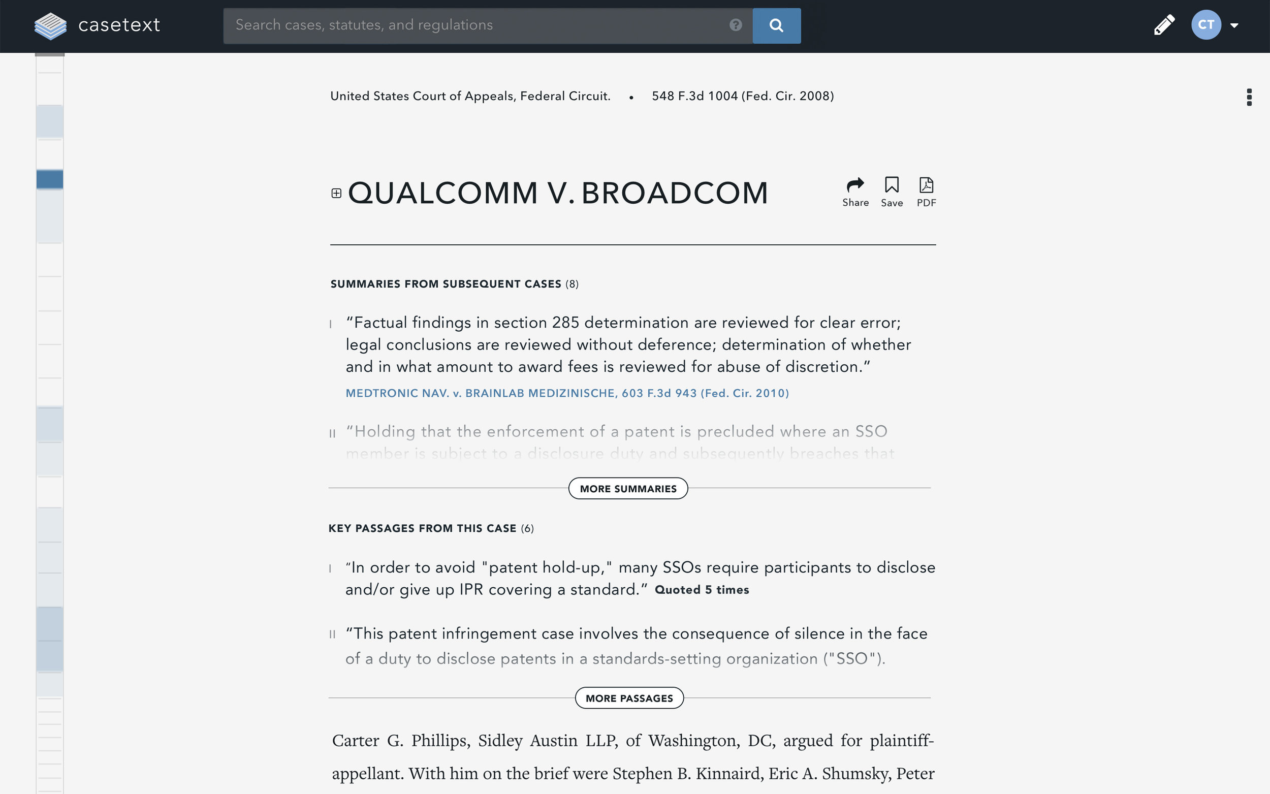
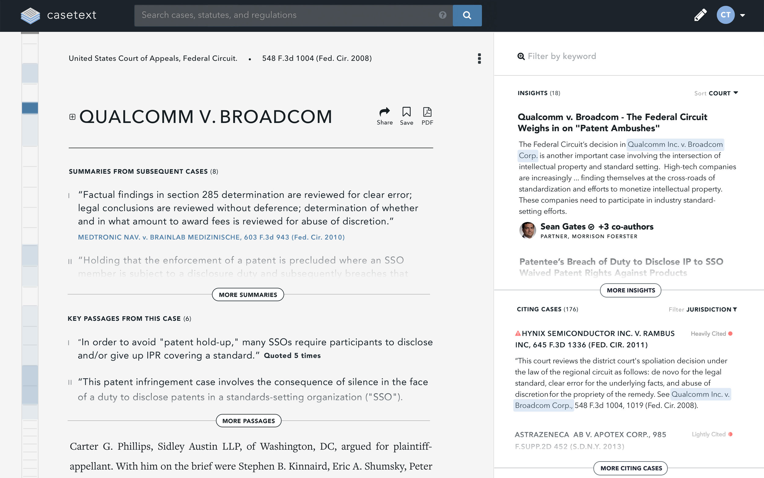
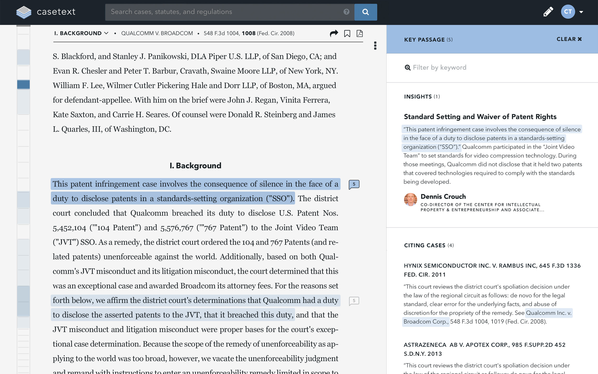
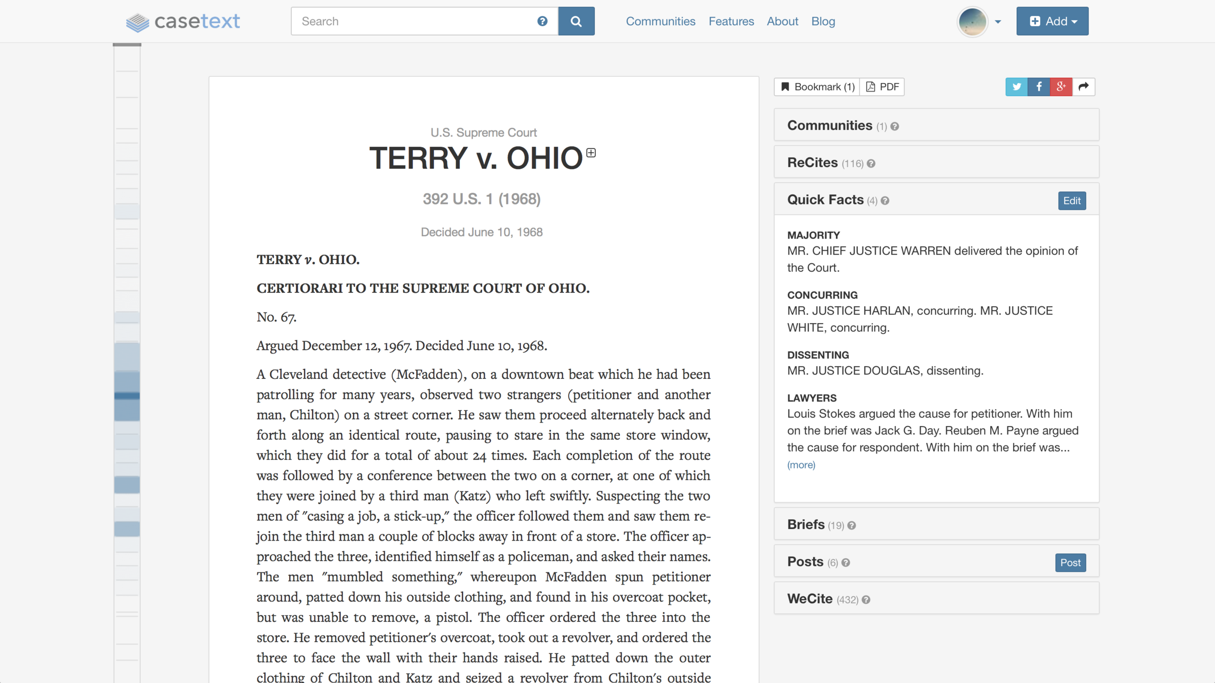
The average user spends upwards of 12 minutes on a case page, an eternity in internet time. Features were developed to maximize efficiency, such as the "Heatmap" – the multi-colored blue strip on the left-hand side which shows the areas of the case have been cited most heavily along with the addition of summaries and key passages just below the case title.
CONTEXT PANEL
An easily accessible side panel displays multiple lenses to add context to a court's opinion. Insights showcase analysis from thought leaders in the legal community. While Citing Cases provide a list of how other subsequent courts have treated the opinion. The panel can be filtered by keyword to spotlight content that matches a specific query, allowing attorneys to quickly determine if the case is relevant or not.
COMMUNITY INSIGHTS
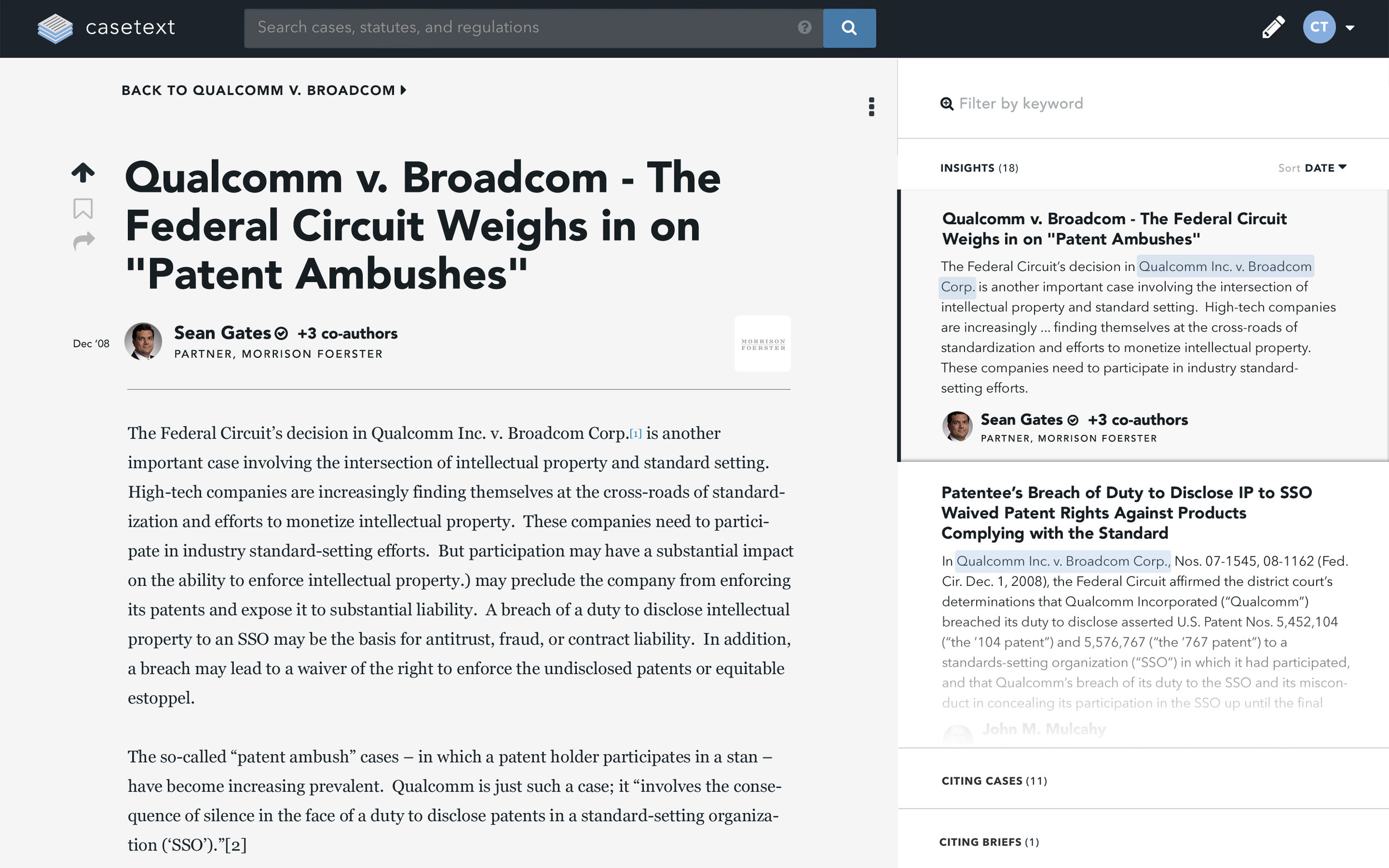
Legal research doesn't follow a linear path. Attorneys often find themselves lost amidst many tabs and windows while they evaluate multiple source materials. We designed an interaction to alleviate this pain point. Clicking on any item in the context panel activates a transition which loads an article or citing document on a layer just above the case. This way, the reader can access multiple articles and documents while never having to navigate away from the case – thus streamlining their research and giving them a sense of control and place in their process.
Jurisdiction Filters Concept
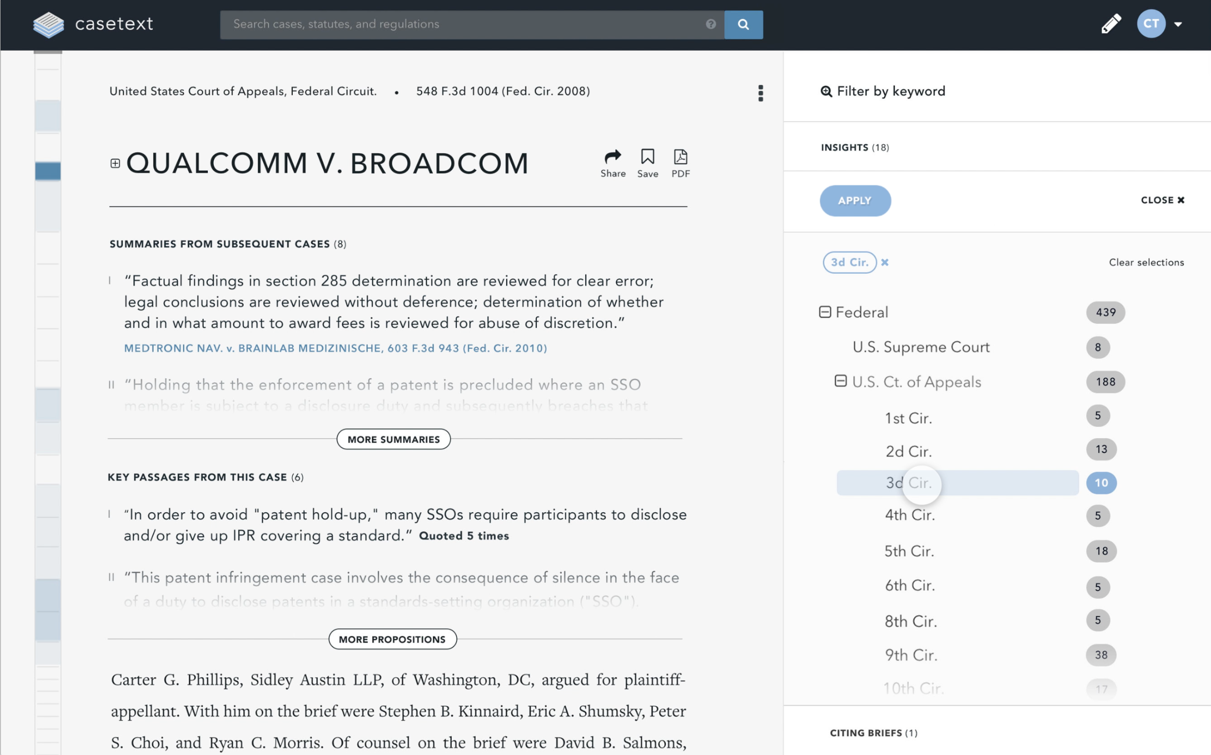
Focused tasks are one of the tenants of the design language. Rather than unnecessarily obstructing the reader's view, modals are selectively placed within their appropriate contextual surroundings. In this view, a list of jurisdictions overlays the citing cases section in the context panel and fades away once a jurisdiction(s) has been applied.
DOCUMENT OUTLINE
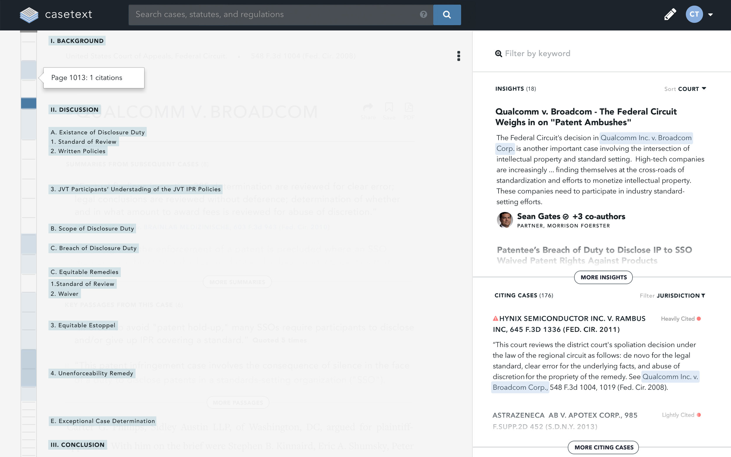
In another example of focused tasks, when a user hovers over the heatmap, a document outline is presented as an overlay in the space previously occupied by the court opinion, allowing for easier navigation within the document itself.
INTELLIGENT SCROLL & KEY PASSAGES
Another one of the main tenants of the design language is intelligent use of scrolling. Scrolling is the easiest and most ubiquitous user interaction on the web. A lot of thought went into how to best leverage scrolling behavior on Casetext. The intention was to create a perception that the UI was intuitive and adapted itself to the reader's needs – signaling important passages, becoming visually quiet when it mattered most and even resetting itself once a user has scrolled away from the selected passage. Clicking on a key passage would then filter the contents of the context panel to only show items directly related to that particular passage. Here color is used to signal the relationship between the selected passage and the resulting context panel items.

View it in action
Casetext's mission was to make the law accessible and understandable by everyone. Serious research powers wrapped in elegant use of white space and beautiful typography created a pristine reading experience. Time saving features complimented other tenants of the design language which consist of focused tasks and intelligent use of scroll. You can read more about them below, but there's only so much words can show. Why not see it in action for yourself.
LEGALPAD
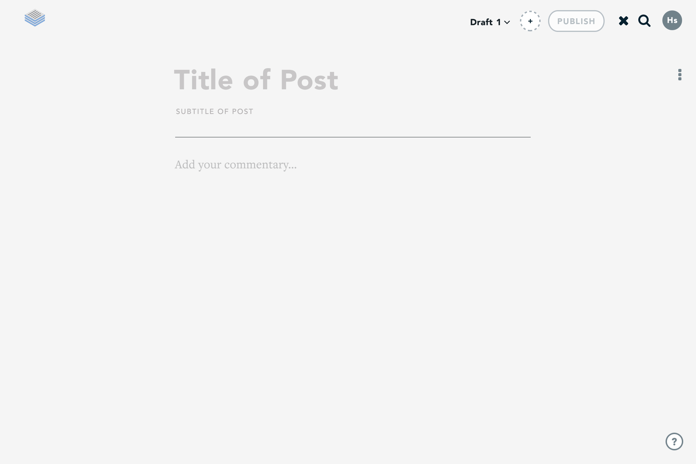
Casetext's mission was to not only change the way attorney's read the law, but also how they write about it. LegalPad was an in-browser text editor designed specifically for legal writing. Emphasis was placed on creating a zen writing space which gave users access to their previously bookmarked cases and passages.
Working drafts Concept
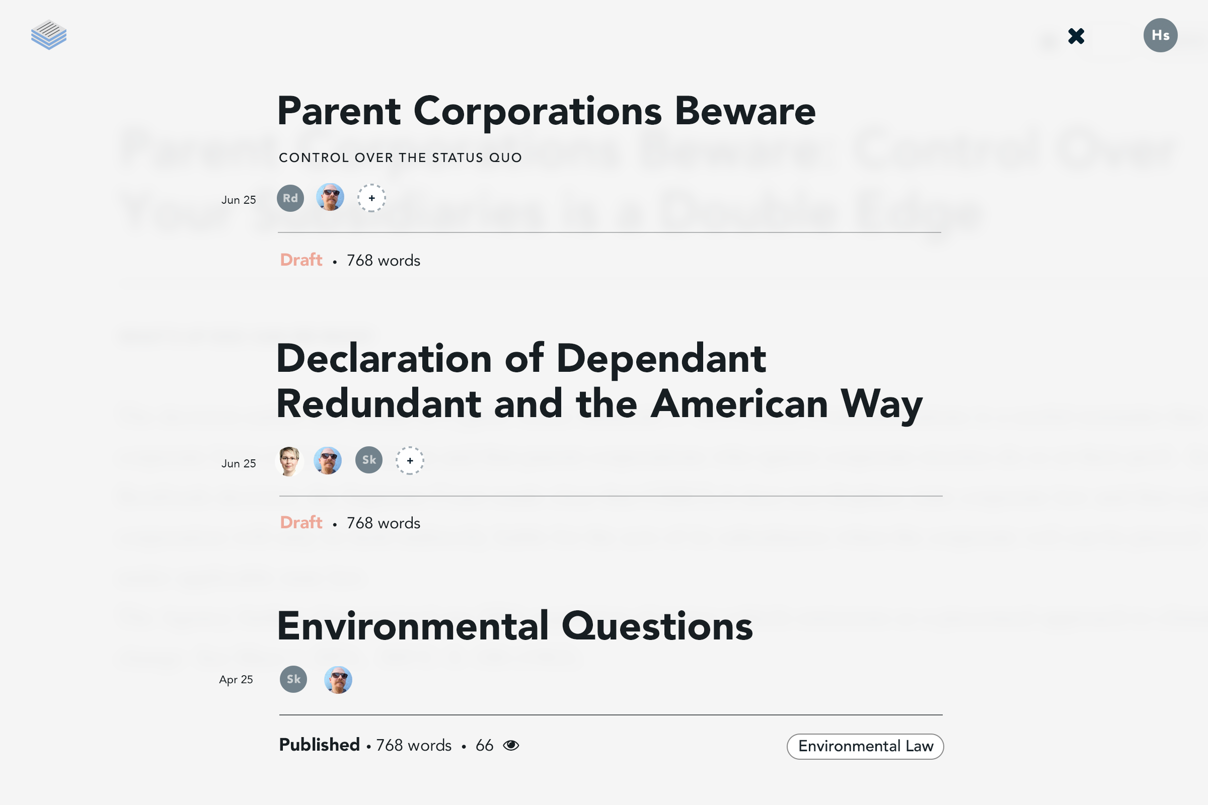
This application view depicts a chronological list of working drafts a user had yet to publish as well as those already shared within a specific legal community. Here the writer can view who they are collaborating with and extend new invitations. Clicking on the title will load the draft into LegalPad for further editing.
Chronological Bookmarks
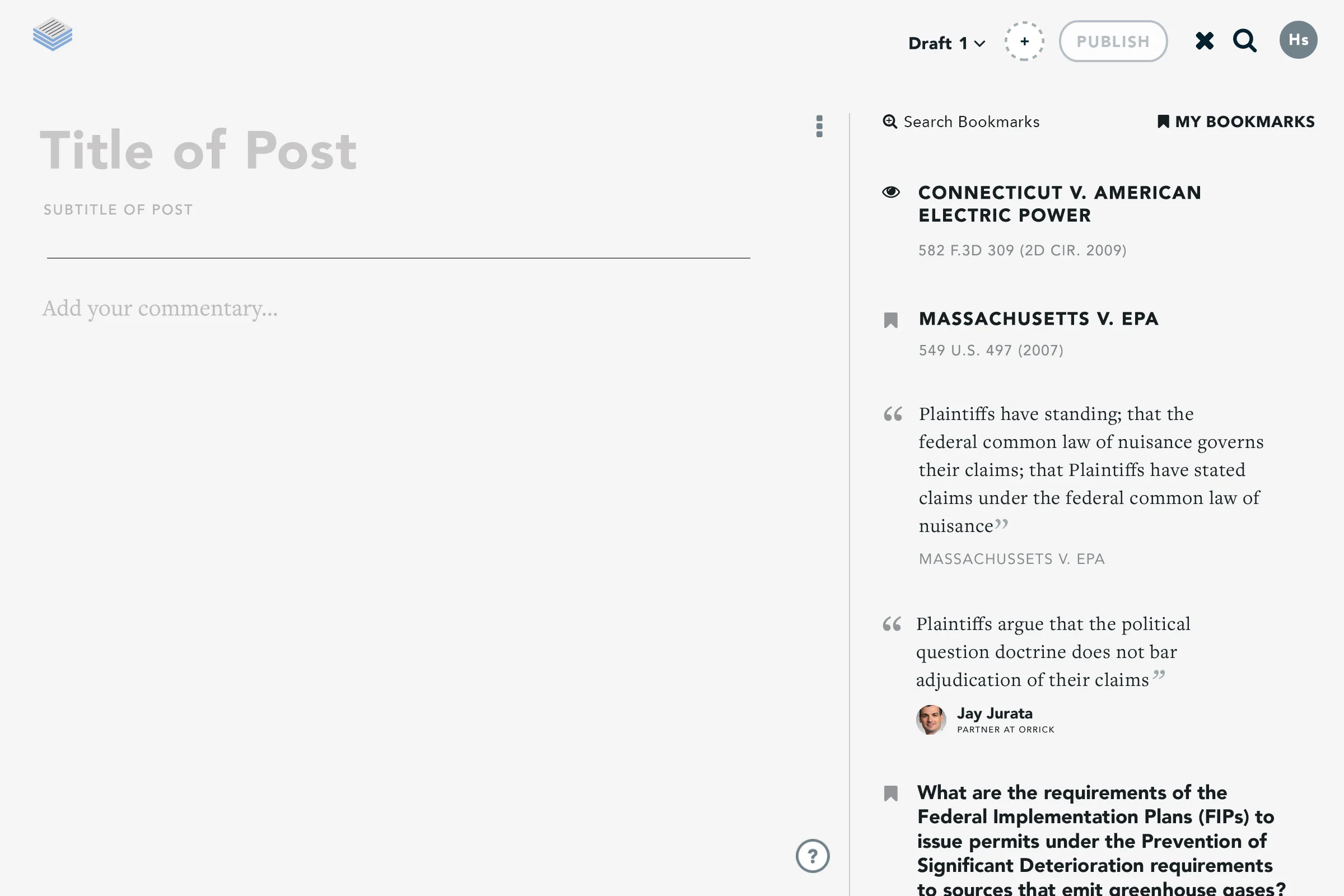
Bookmarked cases, articles and passages previously saved would be available in the side panel for easy access. Here the last item a user had interacted with would appear atop of their list. The user insight which lead to this feature was quite simple – the last item touched should be easiest item to access.
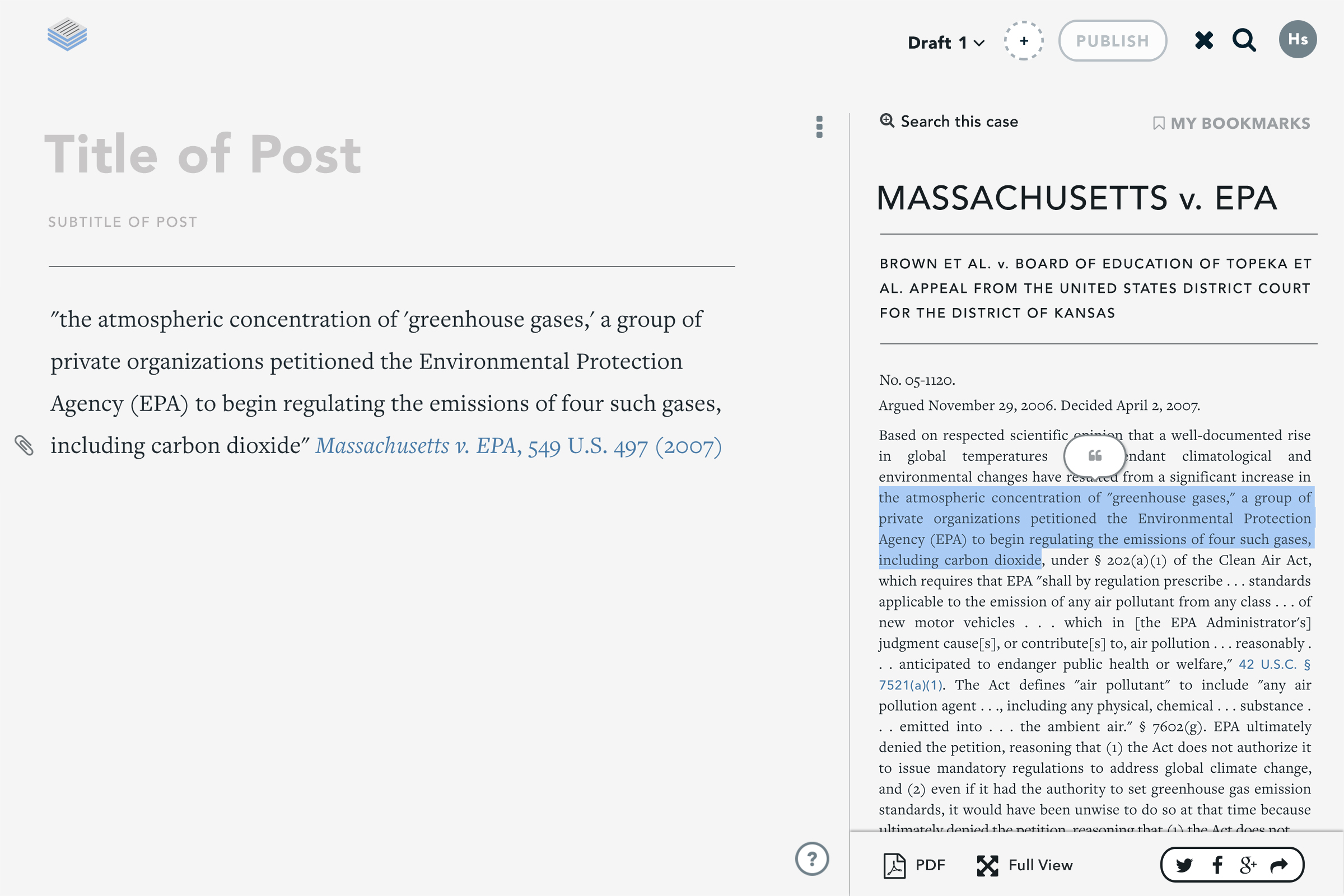
PocketCase
Any item in a user's list of bookmarks can be loaded into the panel for referencing in their draft. Here, user's can highlight passages directly from the case and insert it into the body of their draft. Searching the case for specific keywords allowed attorneys to spotlight the parts of a case that was most important to them.
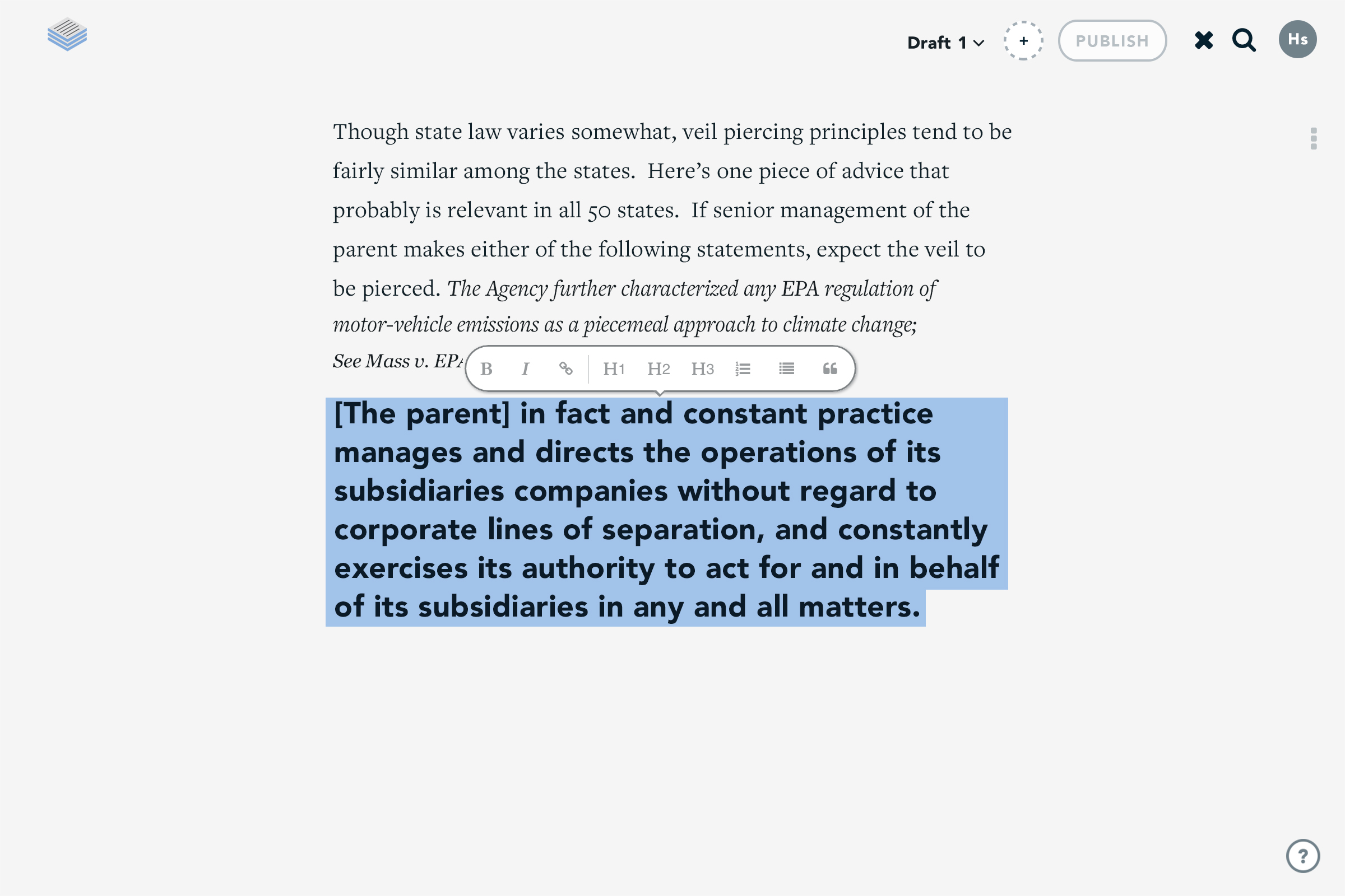
Style bar & Formatting
As users continue writing their drafts, they are able to highlight specific portions and apply a preset of formatting styles. The style bar was contextually aware and would only appear once a word or sentence had been highlighted and would reposition itself to accommodate the writer.
Interested in seeing all this in action? Watch a collection of screen recordings of the product.
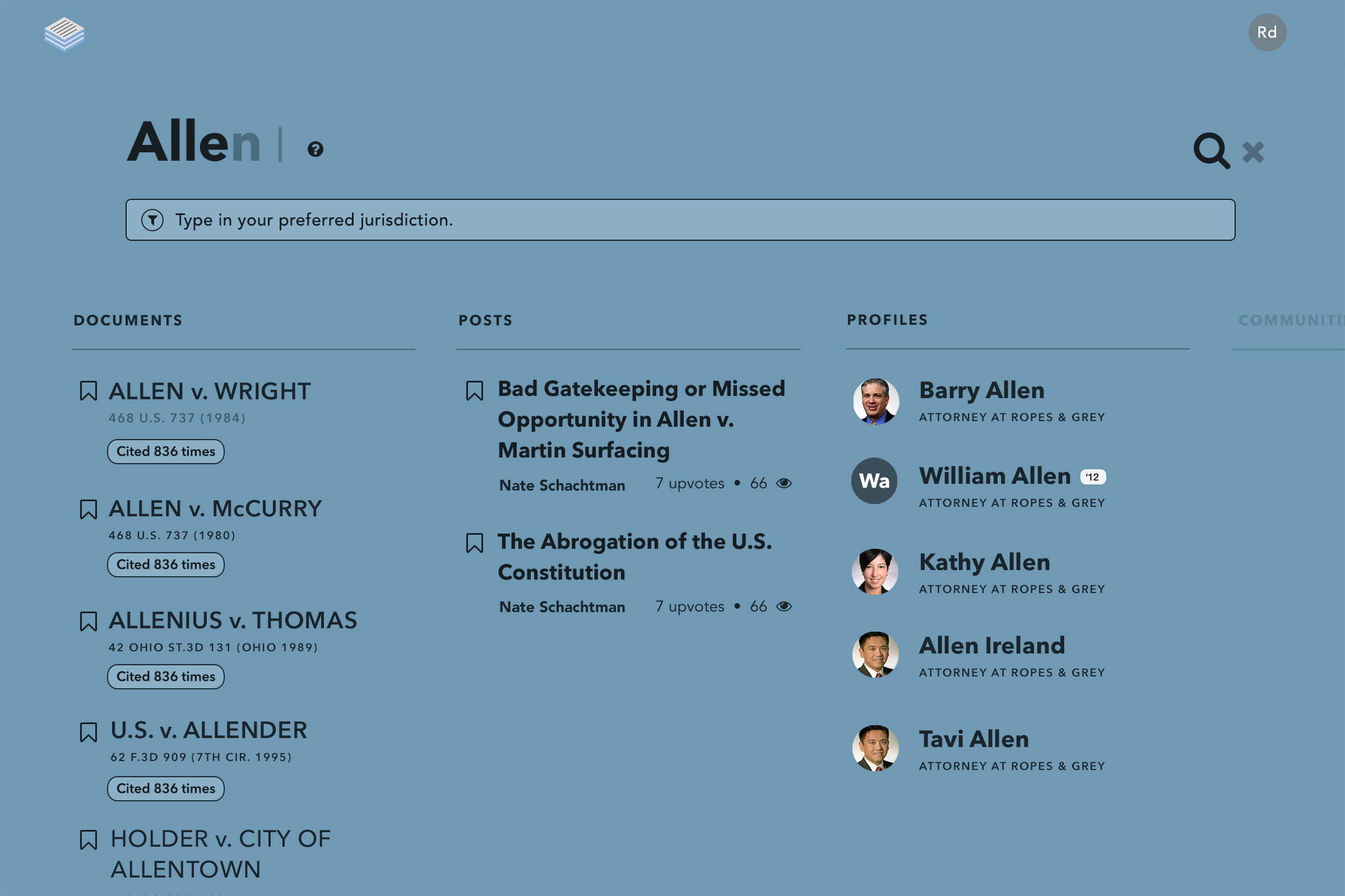
SEARCH LAYER CONCEPT
Occasionally I like to dabble in motion design, especially if it effectively portrays a concept. Adding motion to a design is a powerful tool. This video shows a concept of a search layer in action. I designed and animated this demo for a presentation of what search could be on Casetext.
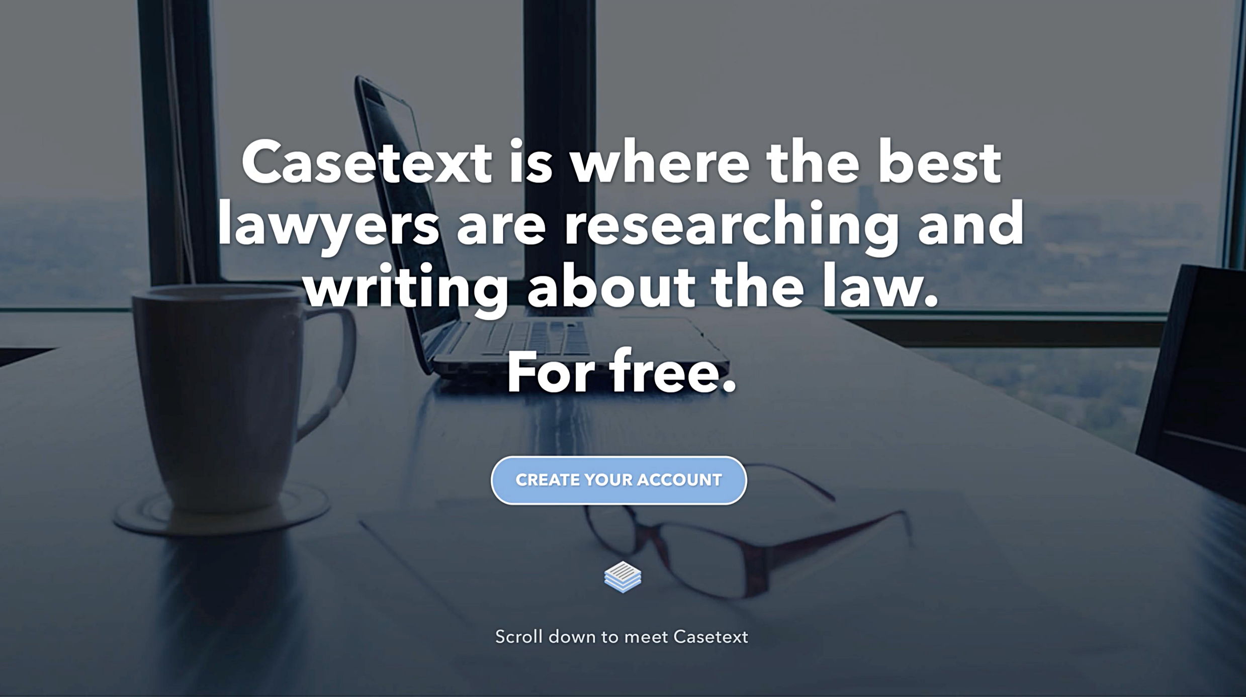
Prototype: Homepage Marketing Page
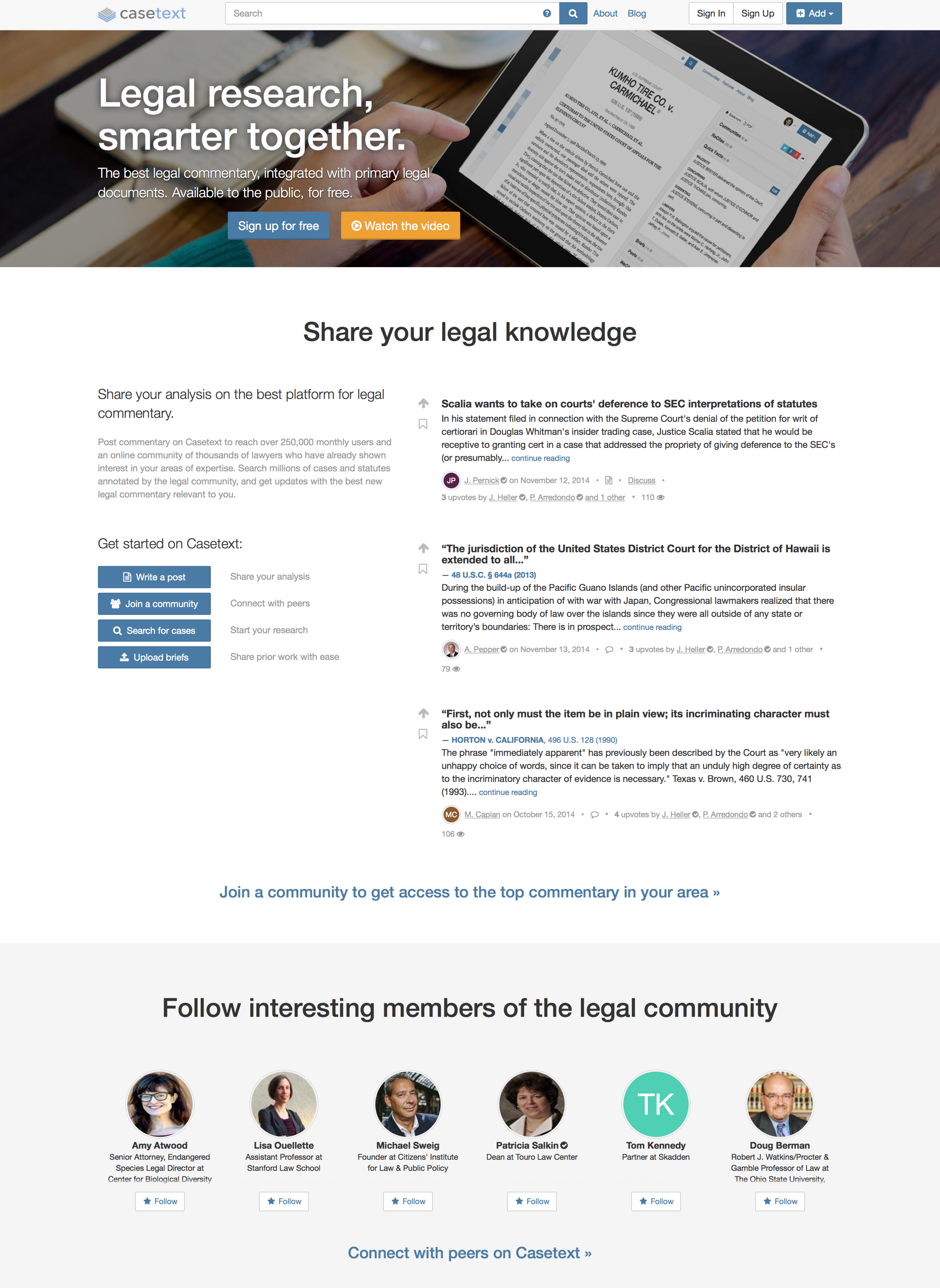
We wanted a compelling way to introduce the product while touching on features of the recently released case page and legal publishing tool. This video was used to demo the concept to our internal team for feedback and ultimately used as direction for implementation.

Before LegalPad
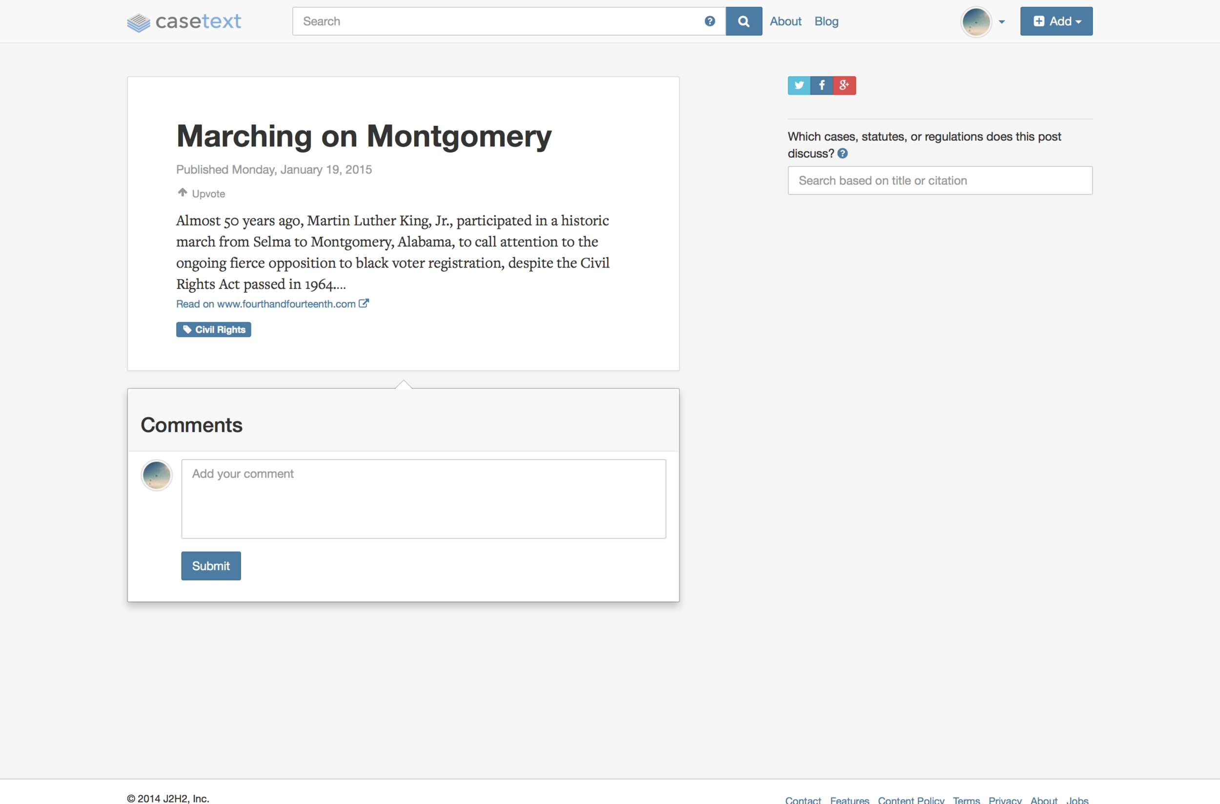
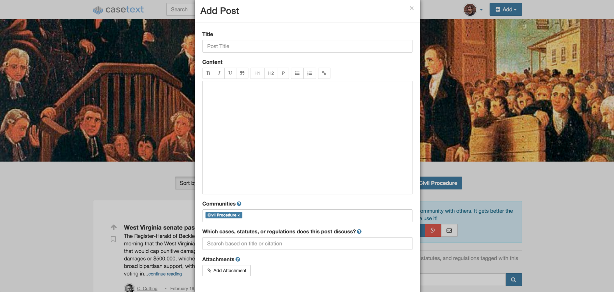
Prior to the creation of LegalPad, users would start a draft within a modal window. This constrained UX was not an effective way to contribute substanitive analysis. The editing tools were limited and there was no way to start on a draft and continue it later.
